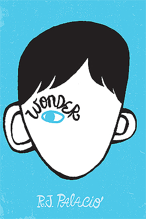

English, Portuguese and French covers:
I'm a big fan of the original English cover. I like the simplicity of it and the way it kind of manages to tell some of the story. It fits nicely with the atmosphere of the story as well. The Portuguese cover looks like something from a graphic novel. To me, this would fit well as a cover for either a sad graphic novel or a book about something medical or hospital related, like STDs or mental illnesses maybe. I'm not entirely sure, actually. Anyways. The French cover is nice, but not as pretty as the original. Would still like to have on my shelf, though.


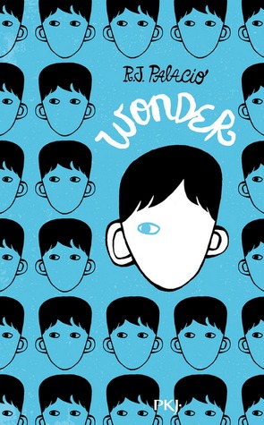
German, English, and Indonesian covers:
The German cover confuses me. Not because I don't understand what it's trying to convey, it's just... befuddling and weird. Not very pleasant to look at. The English cover (idk if this is a movie cover? Is there a movie?) is okay, actually. A bit plain and ordinary, but I like it all the same. The Indonesian cover is very pretty. It looks a lot like the original, but they changed it a little and made it their own. I do prefer the light blue background, but the red one works as well.


Portuguese, Serbian, and English covers:
The second Portuguese cover is pretty bland, honestly. Doesn't say anything about the content of the book and doesn't do the story any justice. The Serbian cover sure is something else, but I love it. It's so unique and I adore the art style. I could hang this cover on my wall. I also find myself infatuated with the red English cover. It does portray the character of August well, and I like the style. If I didn't already have the original cover in my possession, this is the one I would go for.


Spanish, Ukrainian, and Dutch covers:
The Spanish cover is nice, but I wouldn't say that it's a better version of the original. I'm conflicted about the Ukrainian cover. I'm guessing it's supposed to be August? I don't think it looks like him at all; at least not if I'm to trust the descriptions in the book. It think they've tried to change how he looks to make him more appealing and I don't like that. The Dutch cover is boring. Just like the second Portuguese cover, it says little about the story itself. I'm not a big fan.


Slovak, Latvian, and Thai covers:
The Slovak cover... I can't... no... kill it with fire! The Latvian cover, on the other hand, is gorgeous! I love the colours and the clean style! It reminds me a lot of the covers for the Shatter Me trilogy. I like how the title is spelled out by the eyelashes. The Thai cover is also very pretty! However, I would prefer the red English cover over this.


French, Spanish, and Hungarian covers:
First of all, the second French cover is trippy as all hell, but I still kinda like it?! It's just weirdly aesthetically pleasing to me, I guess. I'm not a big fan of the second Spanish cover, though. Again, this is something I could imagine finding as the cover of a book on depression or something like that. It's colourless, depressing and doesn't stick out. And don't even get me started on the Hungarian cover. The monstrosity. Get it off the face of the Earth, please.


Chinese, Arabic, and Russian covers:
The Chinese cover is cute, though I'd preferred it if the motive was a bit larger. The Arabic cover isn't much different from the original, aside from the colour of the background. Orange is an unusual colour on YA books, but I must confess that I like the good old blue one. The Russian cover is okay, though I don't understand how it reflects the story itself. The numbers in the right half of the bottom reminds me of platform 9 and 3/4 for some reason.